
Circles on the sky, part 1
the groundwork of skywork

This is the start of a new series within my exploration of the Prague astronomical clock. In other series, I locate the clock in its historical context and I explain how the horizon on the Prague clock was drawn, compared to how it should have been drawn. In this series, we will work through the basic derivation of an astronomical clock to see how the main design of the clock face and the zodiac circle superimposed on it correspond to the shape of Earth and the Solar System.
In my last post, ‘the origins of a clock,’ I traced the design of the Prague clock back from the writing of Jan Táborský through the work of Christian of Prachatice and Maslama al-Majrīṭī to the three-dimensional armillary sphere that Ptolemy and other ancient scholars used to model the heavens. Majrīṭī’s instructions for astrolabe design begin with the very sensible suggestion of deciding how large you want your astrolabe to be and drawing a circle that big. This helps ensure that you end up with an astrolabe you can both hold and read, and that you start with a piece of material large enough for the final product. Imagine being asked to draw a floor plan of your house and you choose to start with your pillow, working out from there. You might find yourself in the end with an unwieldy and unusable drawing, if you don’t run out of paper altogether. A more sensible approach might be to start with the basic outline of the building, so you know right from the top how much paper you will need and how accessible the final drawing will be.
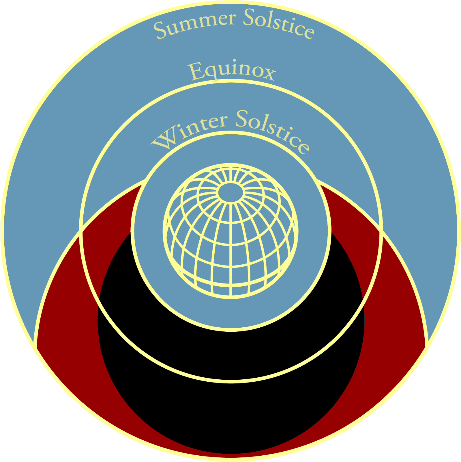
The outer circle with which Majrīṭī begins his astrolabe design corresponds to the line of the summer solstice in the image above, that is, the path the Sun takes on the clock on the longest day of the year. This is one of three concentric circles that defines the face of the astrolabe or clock, along with the line of the winter solstice and the equinoctial circle. The process of deriving the other lines from the line of the summer requires a lengthy sequence of projected lines and circles. Rather than work through Majrīṭī’s full method, then, I will explain the process as if we were starting from the line of the equinox, which is significantly simpler. If you are going to make your own clock, you can reverse engineer Majrīṭī’s process from the one I describe here, so that you too can control the overall size of your clock. Then again, if you are going to make your own clock, I advise you against relying on this newsletter as your primary guide.
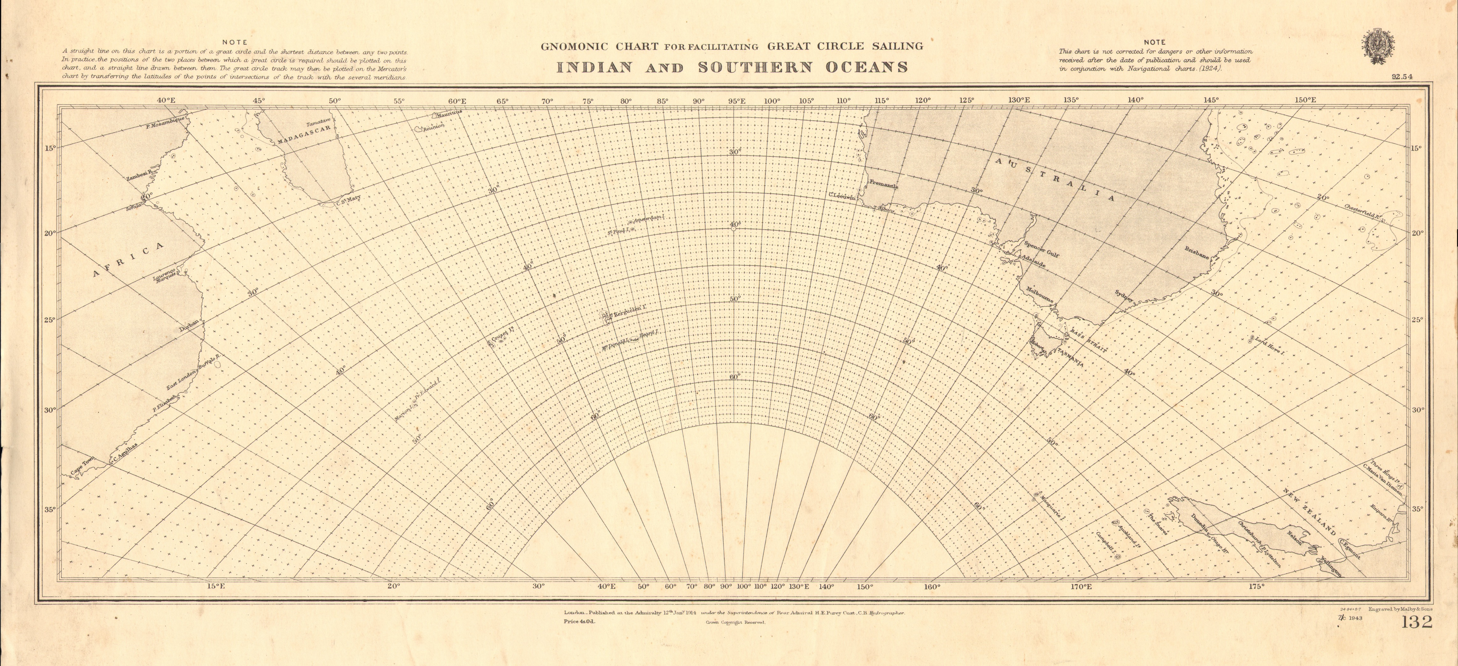
Technically speaking, the clock face is a stereographic projection capturing the tilt of the Earth’s axis. That is, it depicts information about the Earth’s surface on a flat plane and is thus, in a manner of speaking, a map of the world. The stereographic map projection is one of the oldest methods for representing the surface of the spherical Earth on the flat plane of a map. In what follows, then, I am going to talk first about map projections and then come back to the Prague clock. You may remember from earlier posts, however, that astronomical timekeeping and terrestrial navigation are intrinsically linked, and so a discussion of the Prague clock might well involve a discussion of map making.
As with other digressions I have taken, this will not be an exhaustive or systematic discussion of map projections, but will hopefully introduce enough of the concept to get us closer to understanding the Prague clock. Suffice it to say that the stereographic projection works for our purposes because it is conformal, meaning that it accurately captures angles, at the expense of representing area. Another conformal map projection you might be familiar with is the Mercator, developed in 1569 by Gerardus Mercator to address the challenge of trans-oceanic navigation.
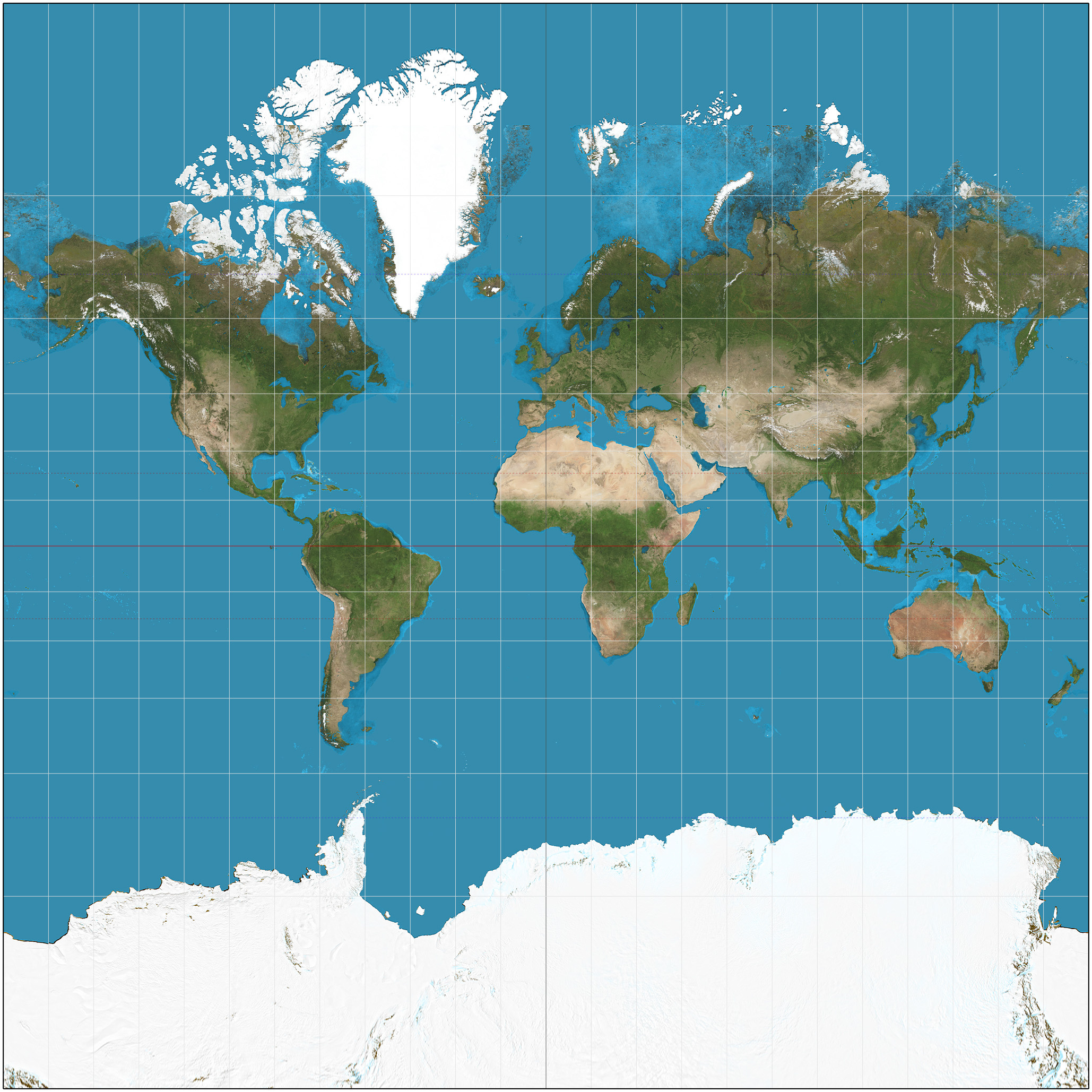
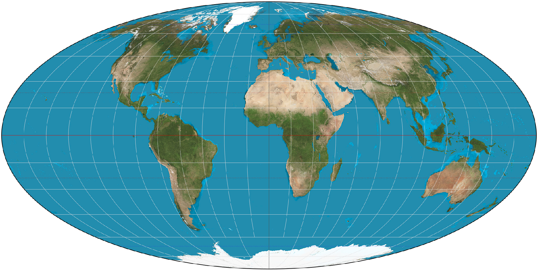
Famously, the Mercator projection distorts the size of landmasses, making areas near the poles seem larger than areas near the equator. As a result, Europe and North America (not to mention Antarctica) take up more space on the Mercator map than they do on a globe, while Africa and South America are diminished. Contrary to the impression given by the image above, Africa is 23% larger than North America and fourteen times larger than Greenland. This perspective, which originated from and reinforced Euro-American colonial imperialist attitudes about the “global south” (actually more like the “global middle,” since most of the southern hemisphere is either ocean or Antarctica), has recently and rightfully been challenged. Simultaneously, the need for physical navigation charts has decreased. The result is the growing popularity of equal-area maps, such as the Mollweide projection, rather than equal-angle projections like the Mercator.
Enough for now about Mercator and Mollweide. A conformal projection is appropriate for our astrolabe because astronomical measurements are all about angles, not area. Among conformal projections, the stereographic is preferred to a Mercator-style projection because it is azimuthal, or planar, meaning that it projects the surface of the Earth directly from the sphere onto a flat plane. By contrast, the Mercator map is derived by first projecting the surface of the Earth onto the inside of a cylinder and then unrolling the cylinder. We want our astrolabe or clock face to be flat, rather than cylindrical, and we want it to be centered around the axis of the Earth. (The Mercator projection cannot have a central point in the same way as the stereographic, for reasons that get beyond our topic here.)
So, what is a stereographic projection, and how do we make one? Imagine a crystal ball with a pattern drawn on it—the pattern of continents, for example, or a graticule of latitude and longitude lines. Now imagine this ball pinned to a blank table surface by a vertical rod (we might call it an axis), along which a light can move. The pattern on the ball will be projected onto the table surface, and this will change depending on how high the light is set above the surface. If the light is inside the ball, then only the bottom part of the ball will be projected. The centre of the lower part of the map will be accurately represented, and the image will gradually distort outward as the light rays become closer to parallel with the table. The upper part of the ball will be projected out into space and not make it onto the map. (This is called a gnomonic projection. On a map made this way, the shortest line between two points on the Earth is always represented as a straight line.)
Next imagine that the light source is an infinite distance above the crystal ball, so that the beams of light fall straight down in parallel. (If you must, you may imagine a perfectly collimated beam of light, like a laser, shining down on the ball, but I find that to be so much less evocative than a naked bulb suspended infinitely high above a table in a room with no ceiling.) This will project an undistorted image of the ball as seen from directly above, but the upper and lower halves of the ball would have to be represented separately. (This is called an orthographic projection.)

Now imagine that the light is placed exactly at the top point of the ball. This is the stereographic projection, and it is our goldilocks point for astrolabe construction. In theory, such a projection would capture the image of the entire surface of the globe, though again this would require an infinite table, and the image would be infinitely distorted for the areas near the top of the ball.
How, then, do we turn this map projection into an astrolabe? Remember that the three circles that we want are the circles of the equinox and the summer and winter solstice. Those are defined by the tilt of the Earth’s axis, which makes the days longer in summer and shorter in winter. The axial tilt of the Earth is currently 23.44 degrees. (It was closer to 23.5 degrees when the clock was made, but I am using 23.44 in all my diagrams. I hope you can forgive the variance, which amounts to about a 0.054% decrease in the size of the winter solstice circle and 0.058% increase in the size of the summer solstice circle. I can say based on experience that this is truly imperceptible at any scale. I can say based on arithmetic that it is 50 to 100 times smaller than the misrepresentation of the summer and winter solstice lines on the actual clock face.)
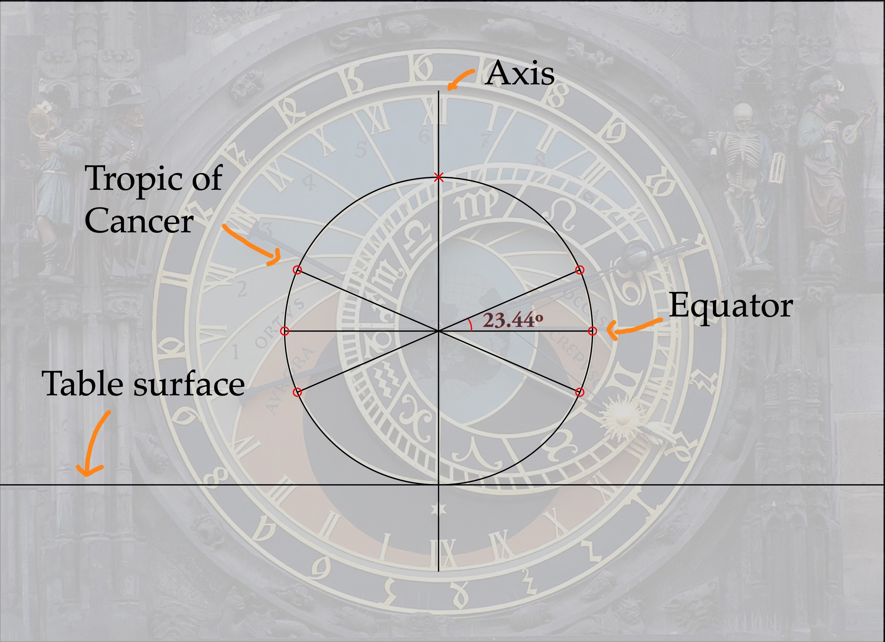
On our crystal ball, then, we consider the vertical rod that the light is attached to be the axis of the Earth. The great circle parallel to the map surface is the equator, and we mark circles that are 23.44 degrees north and south of the equator. These represent the Tropic of Cancer and the Tropic of Capricorn, corresponding to the latitudes on the Earth where the Sun passes overhead on the solstices.
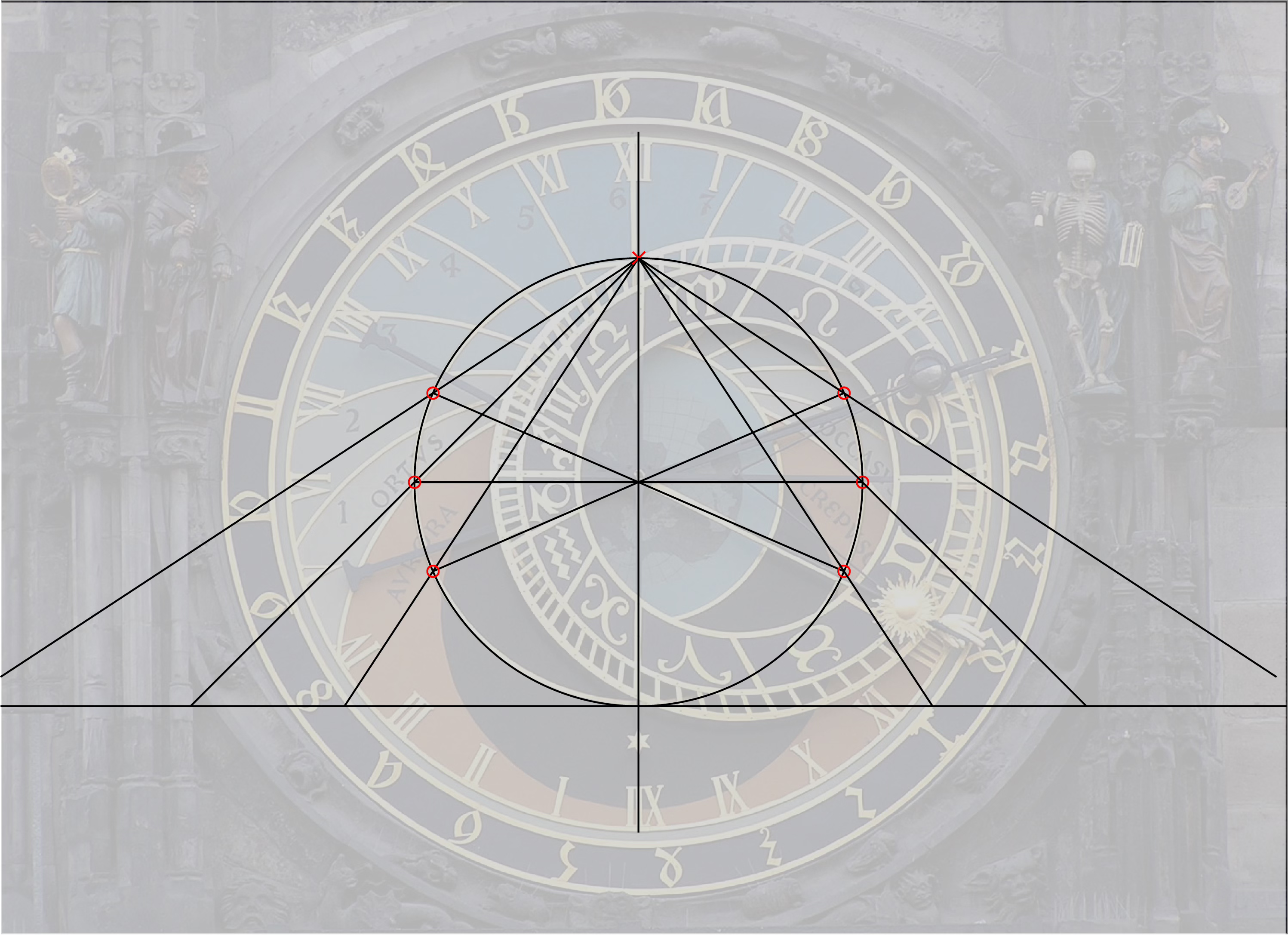
Now, we simply turn on our light and mark where on the map the shadows of the tropics and the equator fall. This creates the relative size of the three circles of our clock face. Because they are all created by angles originating from the same point, their relative size remains constant as we move the map surface up and down.
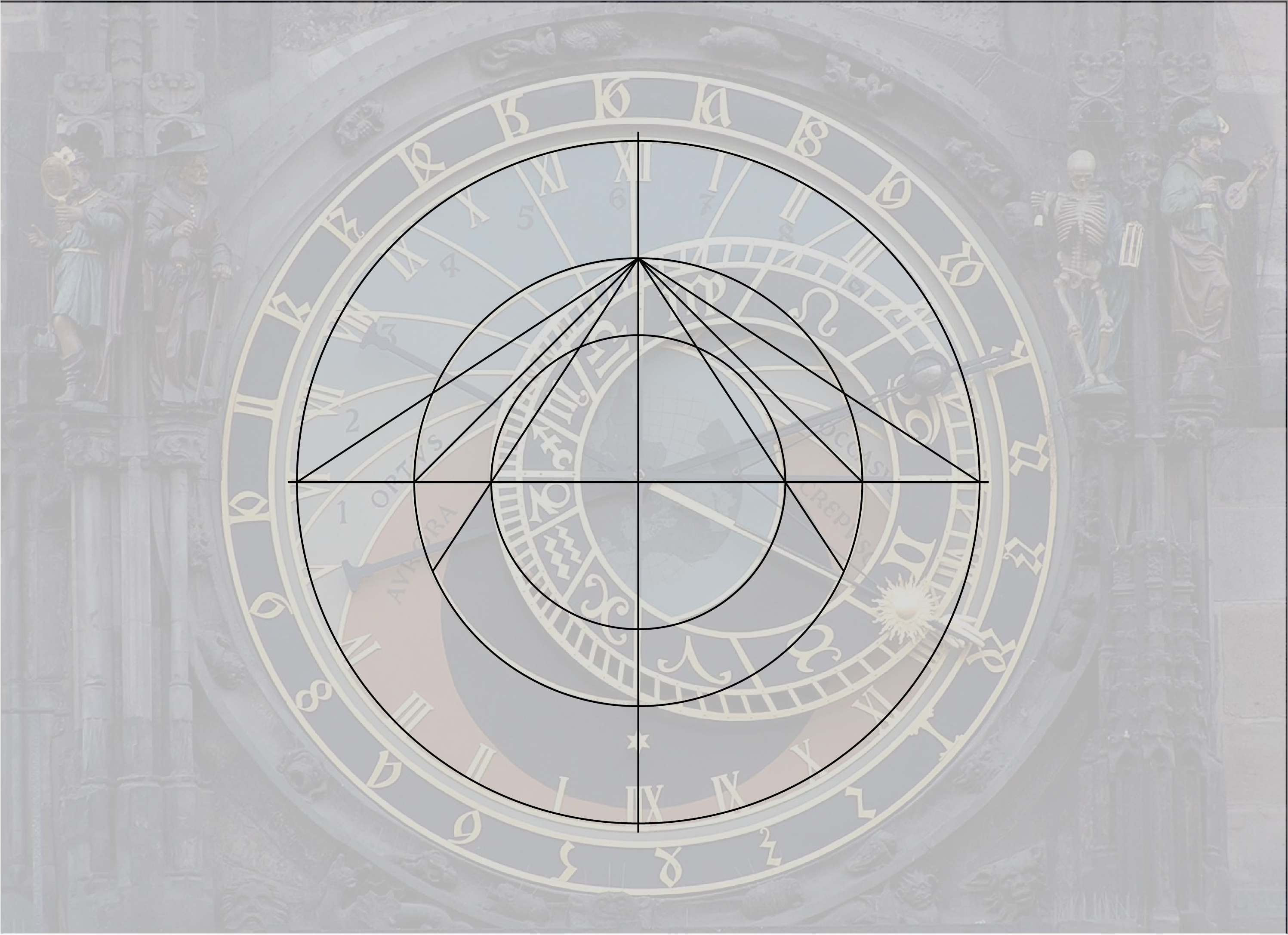
If we let the surface of the map run right through the equator of the globe, our equatorial circle is the same size as the globe itself. The winter solstice line sits inside of this, and the summer solstice line sits outside. This gives us the basic form of the clock face.
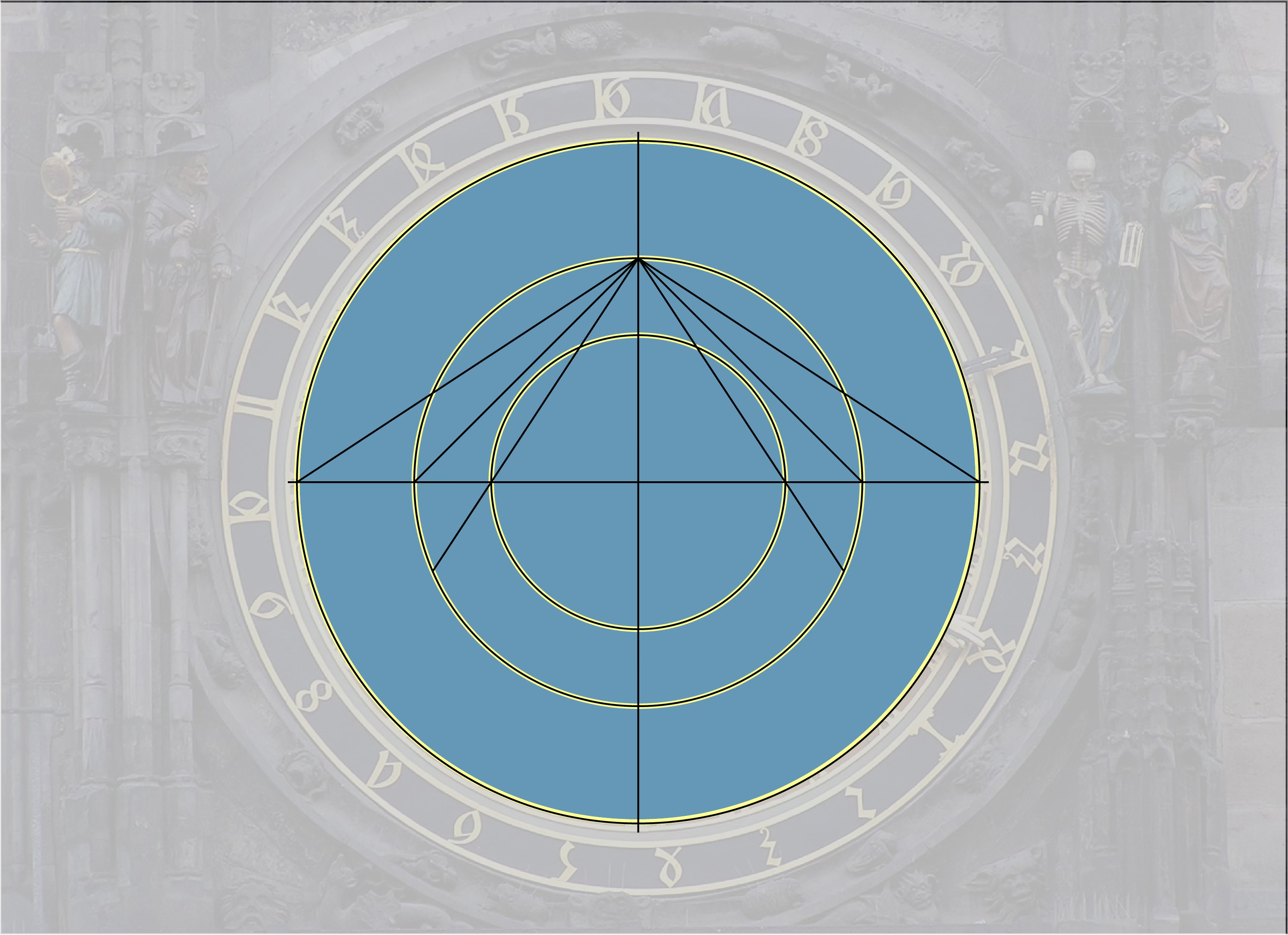
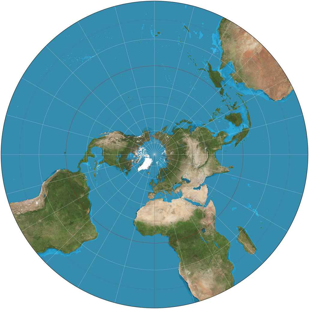
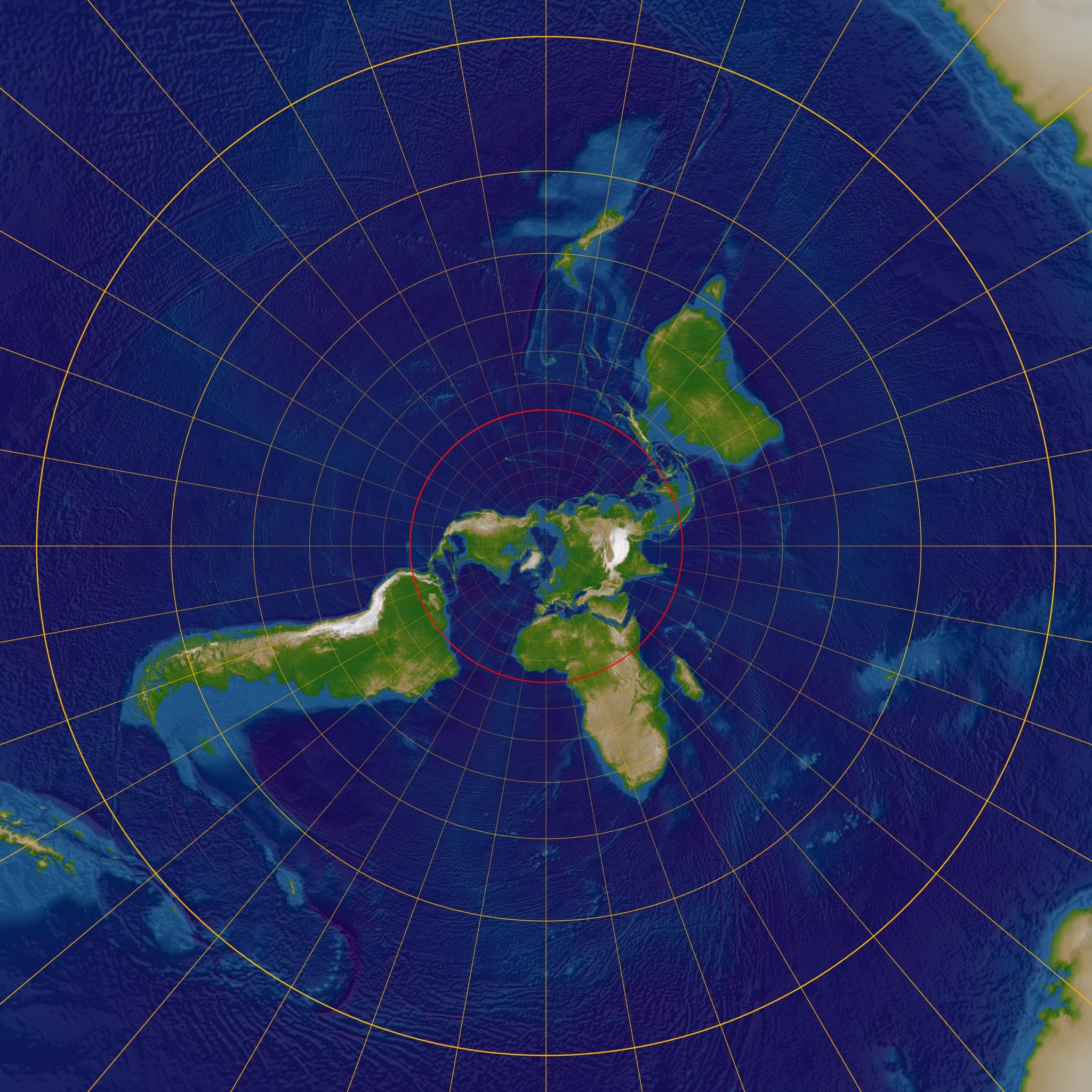
If we compare this set of circles to the stereographic map of the Earth I showed you earlier, you see that the inner and outer gold circles align exactly with the latitudes of the Tropic of Cancer and Tropic of Capricorn.
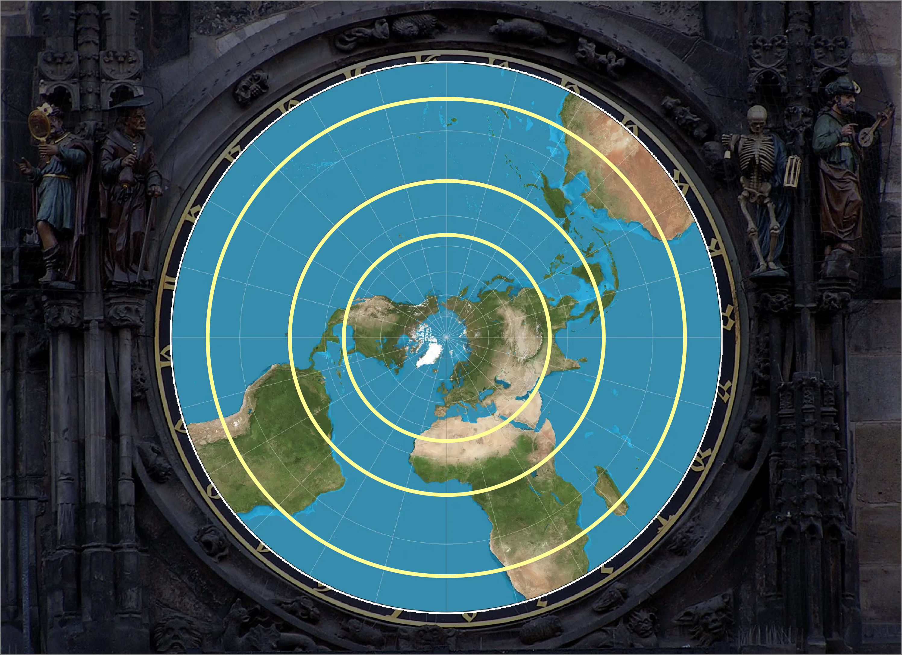
And that is how the astronomical clock is effectively a map of the Earth. The set of circles on which the clock face is based is determined entirely by the angle of the Earth’s tilt. For this reason, any astrolabe or astronomical clock anywhere on Earth will be built around three concentric circles with the same relative size. This is also true of the zodiac circle, which we will discuss in the next part of this series.